
IBM has a wonderful web page about industrial design at IBM that contains a video showing the beginning of the Standard Modular System (SMS); the first standardized solid-state packaging system for IBM. SMS defined not just the way that logic boards were constructed, but also how they were arranged into complete systems. Cabinets were standardized along with the components and cables that made them up. But aside from the original objective of SMS, to reduce the number of parts IBM needed to produce to service computers, it also had a side effect of being one of the first systems to use industrial design concepts. IBM products leading up to this time looked like war-era cars - drab and boring - the cases on them just there to funnel the cool air over the components.
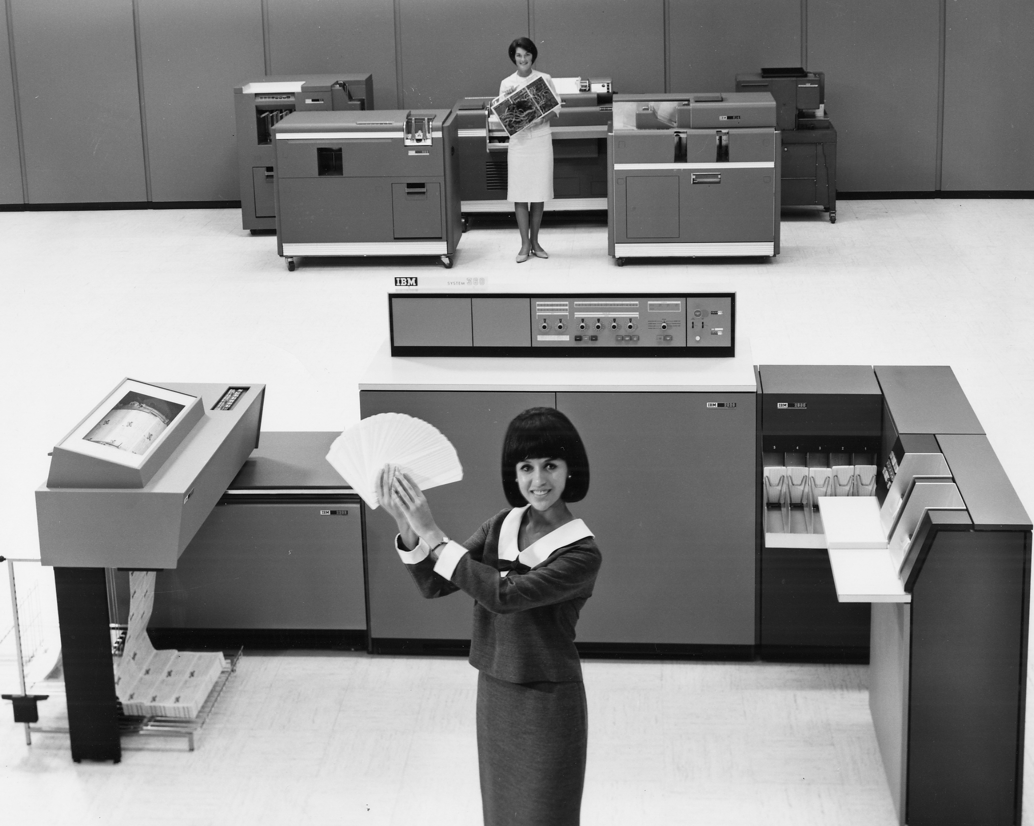
Old, bulky card processing equipment in back, System/360/20 in front.
While those designs worked, they looked out of place due to modern designers like Marcel Breuer, Charles and Ray Eames, and Eero Saarinen. Offices and office furniture were becoming the fashionable designs themselves, rather than merely sporting fashionable designs. Simplicity and new materials were cool, and filigree was out. Mondrian themes, mimicking Piet Mondrian's artwork, were popular. With SMS IBM made the change and released their best selling computer, the IBM 1401. The 1401 had the double-threat of having a good, simplistic design and redesigned peripherals, including a super fast and good quality printer, the 1403. Due to the amount of effort required to design the processors, many of the peripherals present on the 1401 were offered with slight modifications as part of the System/360.
The 1401 fit in with these modern offices. Companies who were proud of and wanted to show off their new computers no longer had to be embarrassed that their computer looked outdated, even if it wasn't.

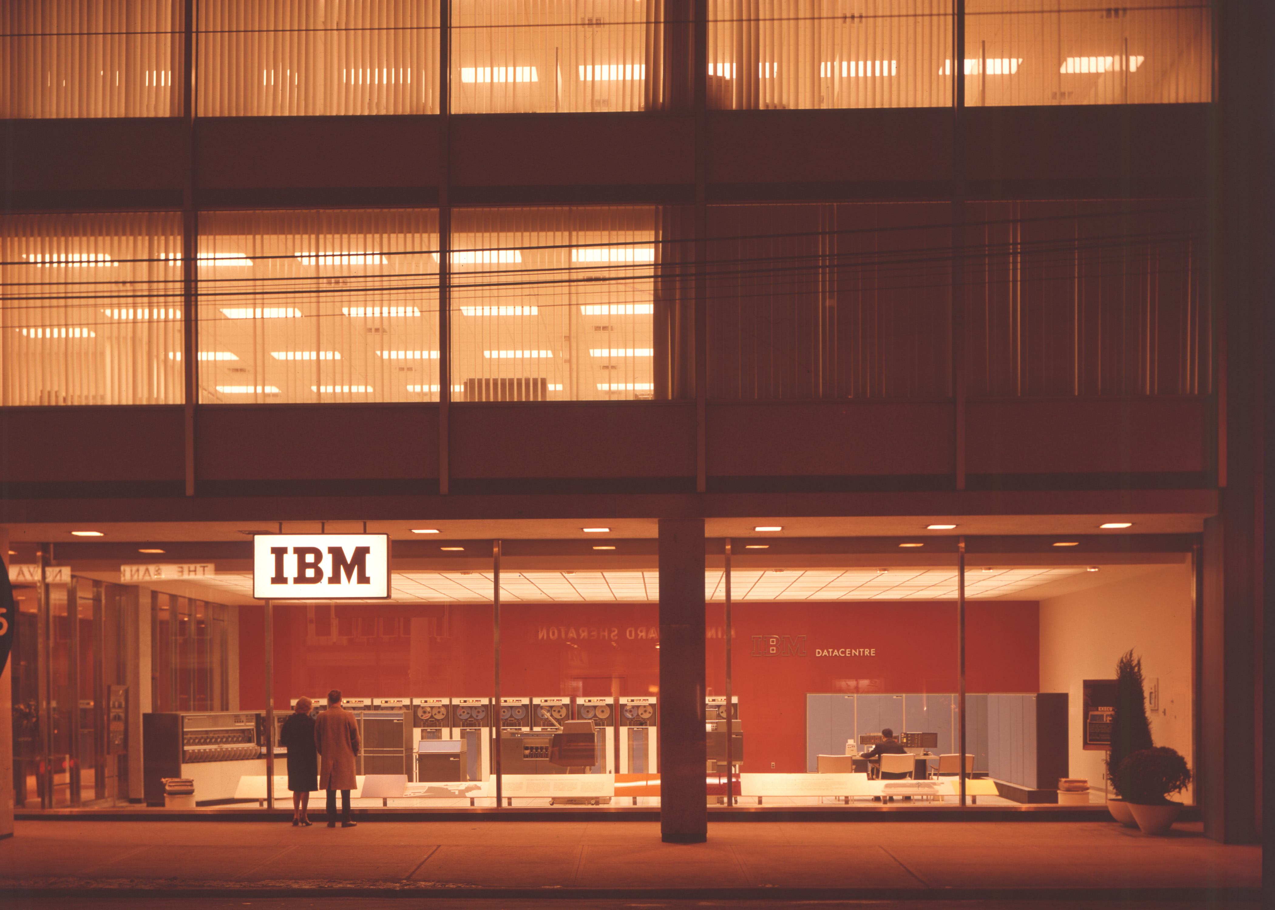
Photos from Ed Thelen's 1401 site
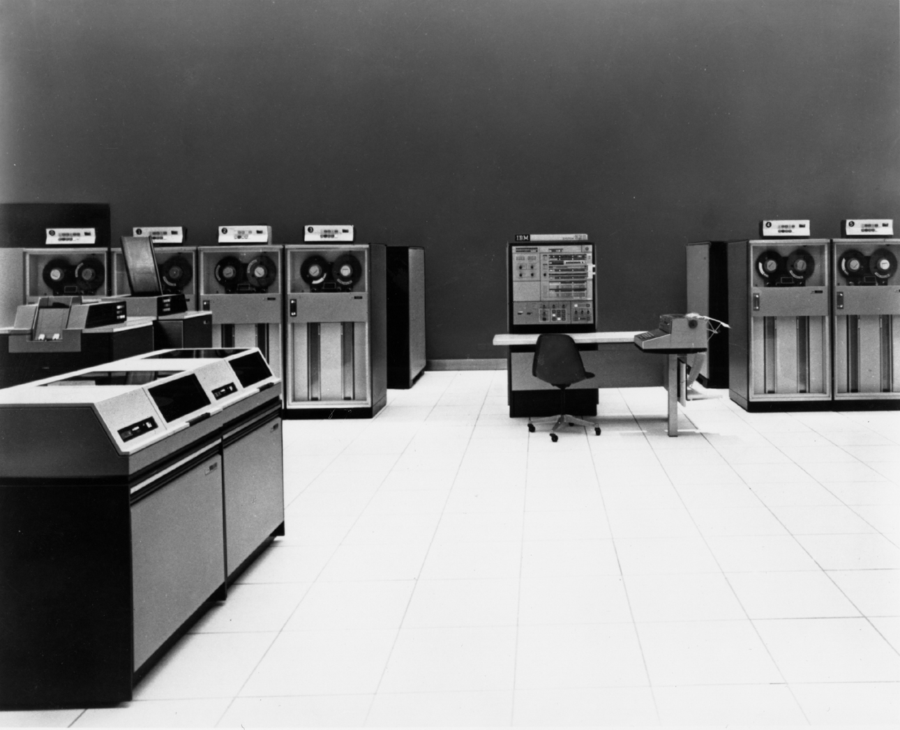
So when one looks at the console of the System/360 and says that it looks "conservative" they're right in a technical sense, but they're wrong in the design sense. It had to look professional and fit in with the environment of a large (or small) business, but also look a bit flashy so as to not look out of place.
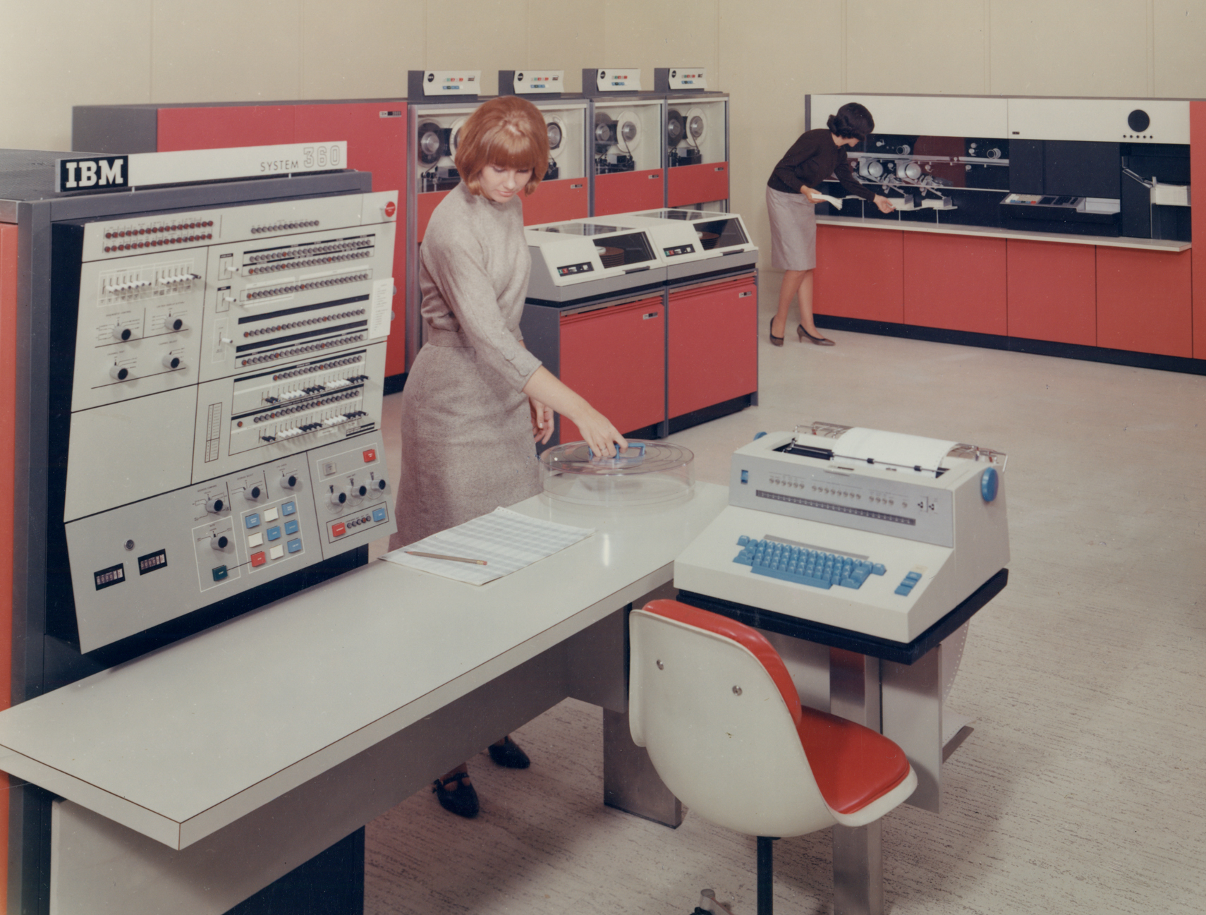
The cabinets of the system itself, bright colors on the doors, black on the sides and tops, look like Eames shelves.
The decision to not make a separate front panel, but hang it on the side of the cabinet, had the positive side-effect of requiring an almost free-floating desk with a built-in console typewriter to be used. This setup makes the front of the computer look quite light and open. The use of bright colors makes them more inviting and eye-catching, but even in black-and-white the computers have amazingly sharp lines and light shades. There are so many great photographs of these computers because they just look so good to begin with.
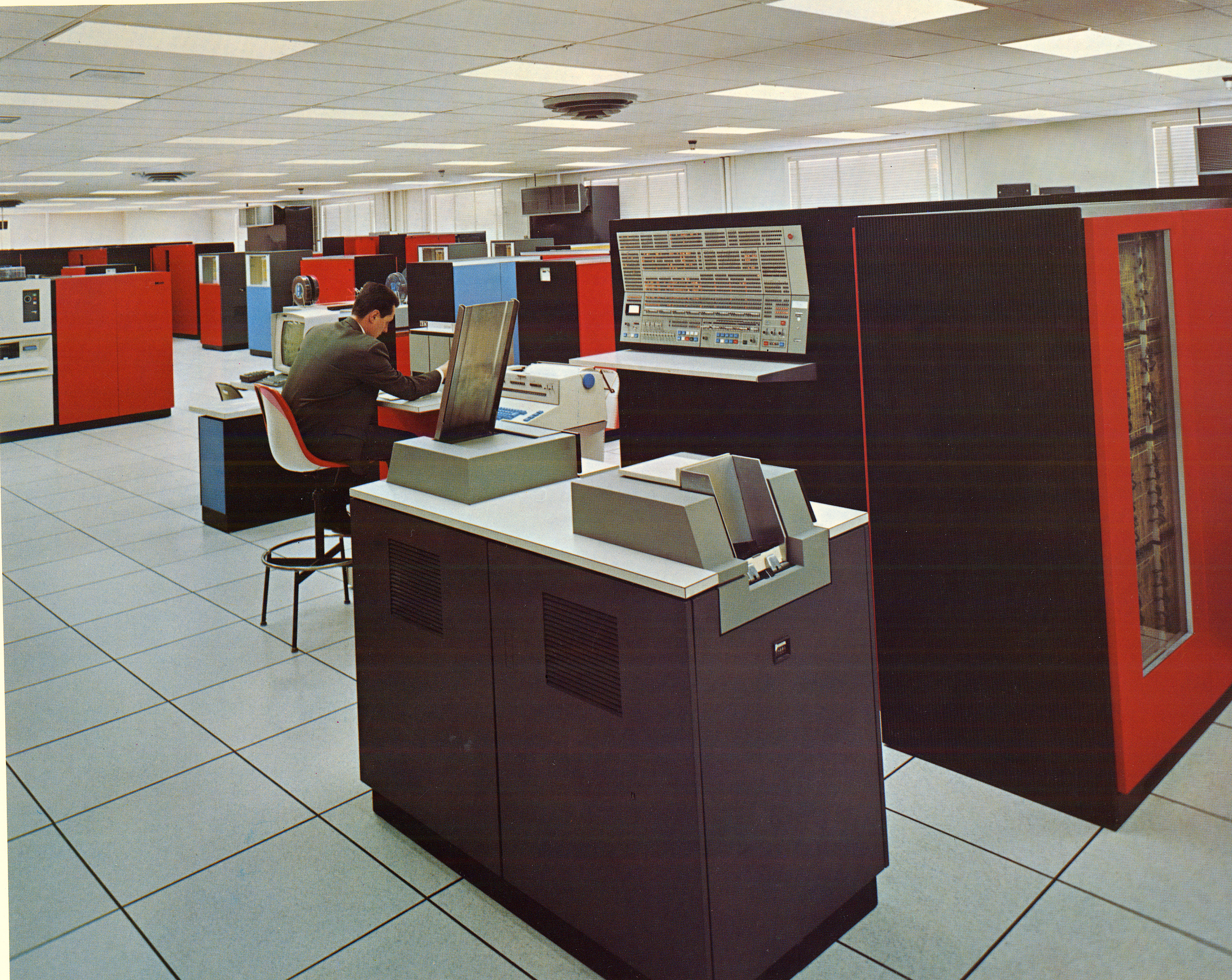
A 360/40 just begging for you to IPL it.
IBM's biggest rival at the time, at least in supercomputing, was Control Data Corporation who had Seymour Cray as their main architect. CDC machines and later Cray Research computers had some quite interesting designs to them, frequently looking like they came out of a sci-fi film. They sold well, not as much as IBM machines, but that was mostly because they were expensive supercomputers. When asked about why the machines had such designs, Cray remarked that if someone is paying a good amount of money for a computer, the computer should look like it is worth it. IBM may not have been able to unseat CDC in computing power, but they did understand this concept - that shows well in the System/360.


It was the man pictured, Tom Watson Jr. who ushered in the era of industrial design at IBM when he became CEO in 1956. Here he is pictured with a model 20.
From the IBM 100 site
No comments:
Post a Comment